Charity donation platform -

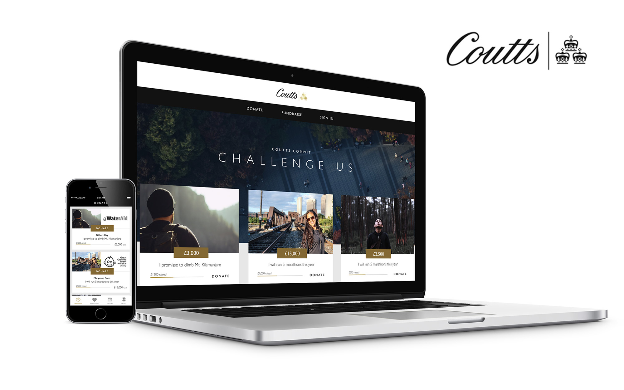
Responsive web app designed for members using various devices.
Coutts approached our team at AKQA to address a brief: They wanted a technology-oriented business idea that would enhance and bring attention to the value of their brand in time for their 325th anniversary celebration event. As a bank with a long heritage associated with the wealthy elite, there was a hard-to-obtain type of customer that would make research difficult. In addition, the amount of time allocated to produce a concept was limited to say the least - a single sprint had to encapsulate a new direction for the business that took advantage of technology and impressed their highly-demanding clientele.

It was important to move quickly with this fairly open brief as time was limited. In our team of four consisting of a mix of business, development and design, we were able divide and conquer according to our strengths whilst working in parallel towards a unified vision - daily standups, periodic communication and check-ins were key to achieving this.
Together we conceived a number of ideas using brainstorming methods such as Crazy 8’s and desk research to understand the private wealth landscape. We also had insight from a private wealth manager as to the types of personalities that would interact with any proposal we had.
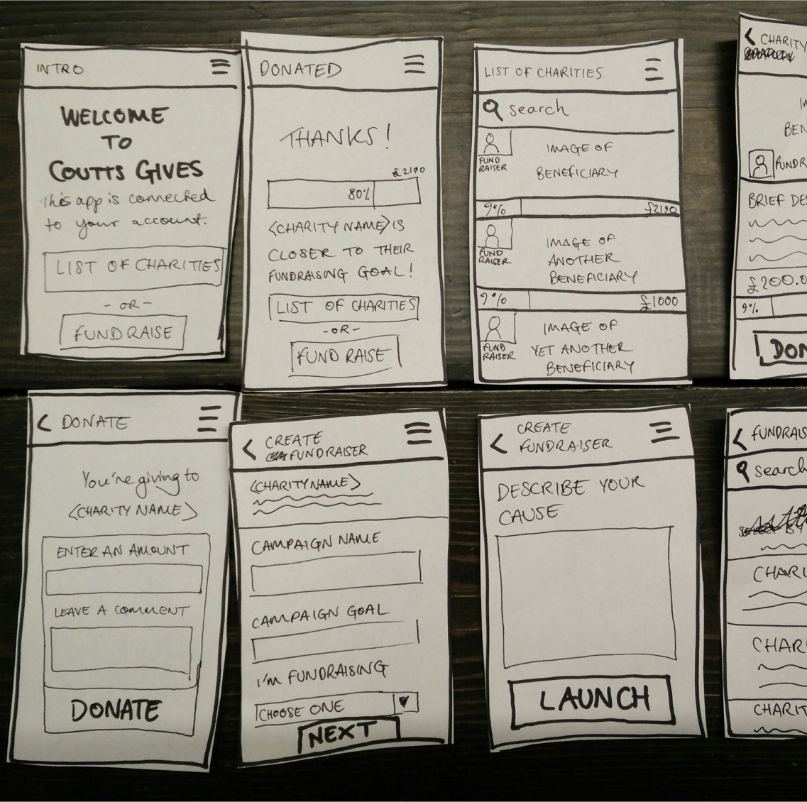
About half way through the available time, a solution in the form of an app was chosen based on its uniqueness within Coutts and the business impact it could have for both the company and its clients. User feedback was key to validating whether the app proposal was a viable one. With a solution in place that satisfied product launch from a business perspective, we tested in quick successive iterations with willing volunteers in the vicinity. We managed to accomodate three iterations before presentation which enabled us to refine the proposal and iron out 80% of the initial issues.
Paper-protyping is an incredibly simple yet powerful way to validate app concepts. Taking inspiration from the Wizard of Oz, puppeteering the sheets of paper allows test candidates to interact with the concept and produce a feeling that isn’t distracted by high fidelity visuals. The skeleton layout and interactions are tested for acceptance without being expensive on either time or money.

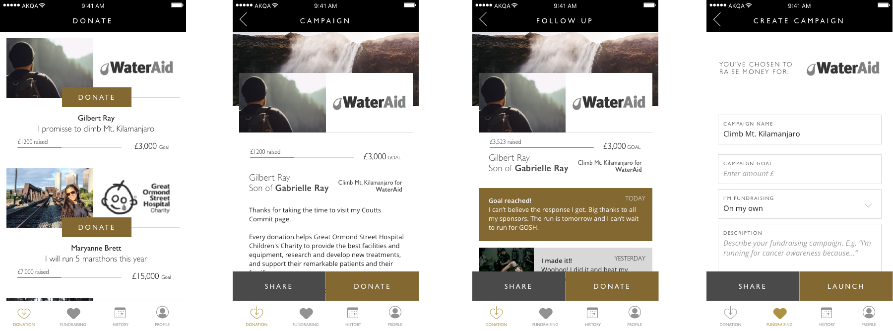
With the paper prototype validated, I was able to define the neater details of the user interface to represent it closer to a commercial release.

Presenting to the client, including Coutts CEO Peter Flavell, the project was very positively received. It was seen as a way to further their involvement in corporate social responsibility and to modernise the bank’s image for their 325th anniversary celebrations as a technology-centred company for the future.