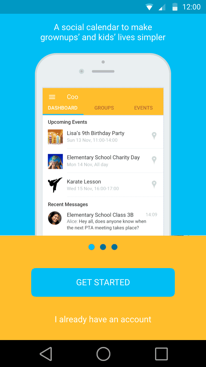
Social calendar app for busy parents -
User-researched mobile application redesign for Android.
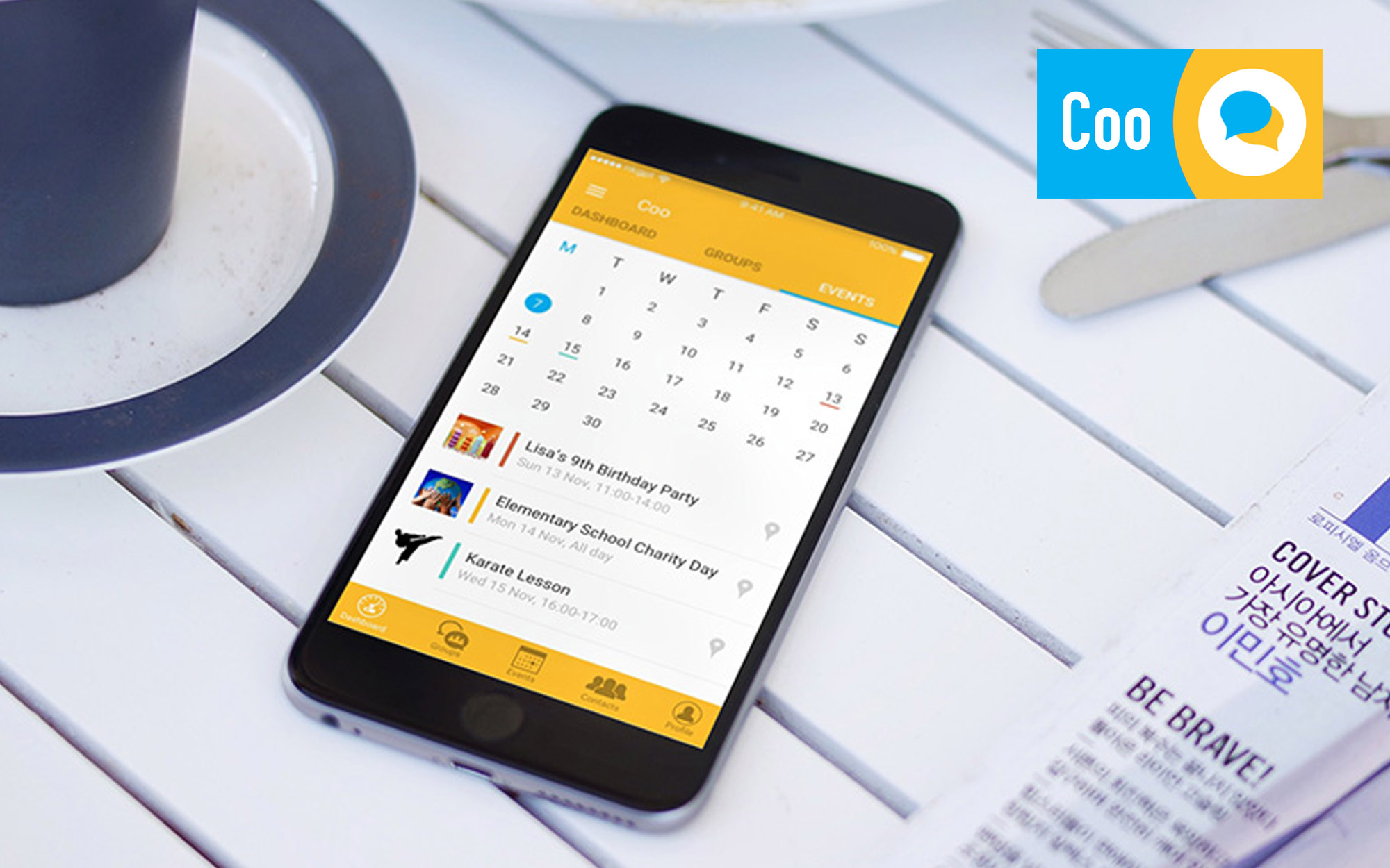
Coo’s founders identified parental communities as social support structures for busy parents of children. From this came the idea for a social calendar app for mobile, bringing organisation and shared knowledge into a single neat platform. Unfortunately, their app suffered from a drop-off in engagement between the point of download and users making their first few meaningful interactions. Working together and using industry-standard UX design principles, we aimed to encourage better engagement with the Coo community.

In diagnosing the problem, I planned and conducted research into Coo’s typical user demographic to understand their current behaviours and opinions. Discovering how they interacted with the existing app design was essential to identifying pain points. Based on these insights, I implemented a new screen flow and interface design with the aim of guiding new users into the app. Explaining functionality and simplifying the visual design into a more familiar yet accessible interface was crucial in enabling better app-to-user communication.
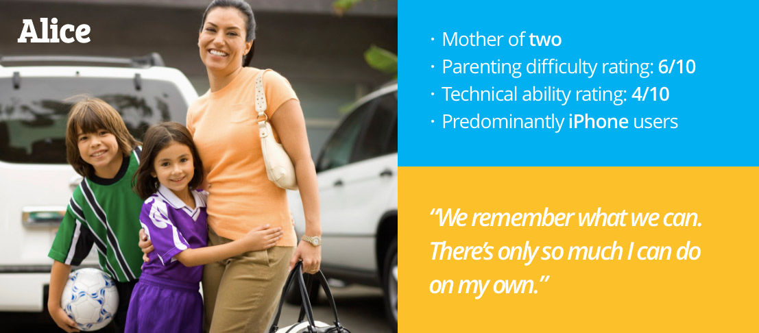
Discovering how parents currently organise their kids’ lives and their approach to interacting with Coo was absolutely critical in identifying the discord within the existing design. I interviewed a range of mothers from 20 to 45 years old in depth and speaking candidily about their parental life.
Creating a persona in the form of Alice aided the design process by supplying a distinct target for empathic problem-solving, consolidating a majority of users’ needs within practical project constraints.
Taking user sentiment and the developed personas into consideration, introducing additional steps and contextual information was a solution to overcoming the highly frictionless experience of the existing architecture.
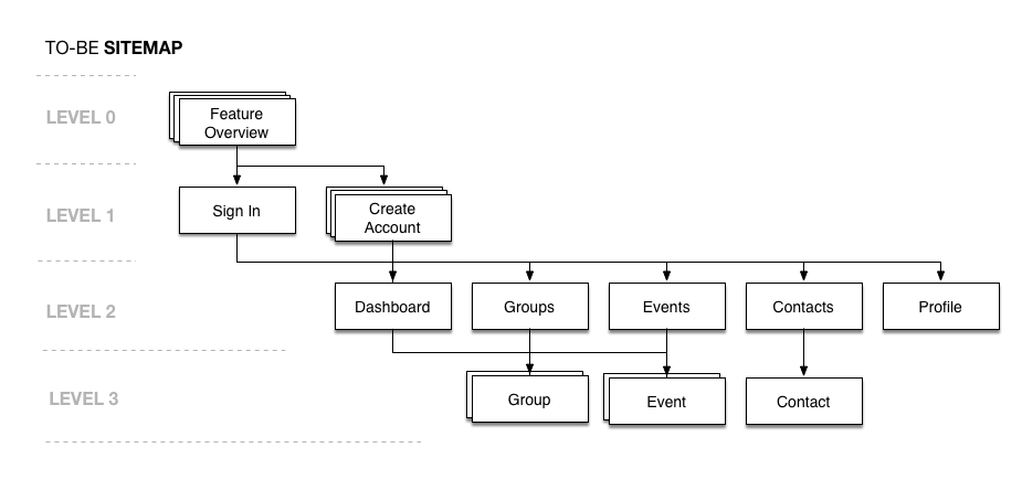
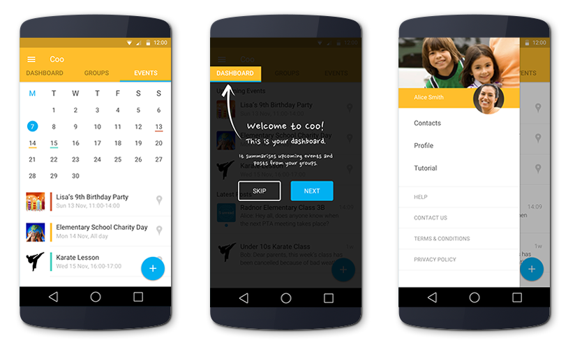
A Feature Overview and a more in-depth Create Account feature was developed, as well as tutorial elements for the key functionality of the app. Additionally, a summary screen in the form of a Dashboard was added to allow a high-level overview of critical information to surface.
As part of their continuous deployment process, the client used an Android-first development schedule in order to test their UI elements with minimal impact upon their wider client base. For this reason, Android-centric UI design was given priority despite research suggesting the iPhone was most common for the designated persona.
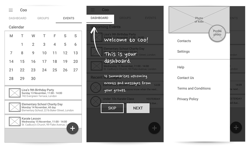
A clickable prototype of wireframes was created to test ideas with users. This aesthetically basic abstraction helped me as a designer to test ideas quickly and in-turn helped users to focus on spatial comfort and app functionality over visual appeal.
To accomodate future growth of the app, I made a decision to work with both Android and iOS. This tactic proved to be a fantastic learning point in efforts to accomodate Material Design and iOS 10 design guidelines within a single user flow tree. Indeed, there exist direct translations of OS-specific UI paradigms that ensure native aesthetics (and thus semiotics) are evoked whilst retaining consistent functionality across both platforms.
Research played a critical role in understanding the problem with the existing app from the users’ perspective - something that gave value not only to the improvement of the app but to the client’s inclusion of the UX process in their development workflow. The biggest learning point we all took arose from the idea that a user flow can be too frictionless - it’s important to guide users into an experience, especially with an unusual digital product like Coo’s where a mix of multiple selling points exists.
Low friction is good but too low friction can be detrimental to an app experience - a balance must be struck.
I presented my findings and proposed solution in a twenty-minute presentation to a room of Coo’s stakeholders. Taking questions live throughout, the client received the proposal positively, actioning important changes to the next version of their app published in the app store.
“These change recommendations have been very helpful for us and will definitely improve our user acquisition and engagement. We hope to work with Nik again very soon.” - Amit Rai, Co-Founder at Coo.